Watermark Opacity, Size and Color: Settings That Work

Most people get the placement of a watermark roughly right. Where they go wrong is the settings: a mark so faint nobody notices it, or so heavy it ruins the picture. This guide gives you clear starting values for opacity, size, color and margin, and explains when to change them.
Opacity: start at 40%
Opacity controls how see-through the watermark is. At 100% it is solid; at 0% it is invisible.
- Portfolio and social media: 30 to 45%. Visible, but the photo stays the star.
- Client proofs and stock previews: 50 to 70%, often as a tiled pattern, because the goal is to stop people using the image before they pay.
- Product photos on your own shop: 20 to 35%, small and tidy. Shoppers should notice the brand, not fight it.
If you are unsure, use 40% and adjust after looking at the result at full size and on a phone.
Size: measure against the image, not in pixels
A 100-pixel logo looks huge on a small image and tiny on a 6000-pixel photo. Think in percentages of the image width instead:
- Signature-style mark: 10 to 15% of the image width.
- Brand mark over the subject: 20 to 30% of the width.
- Tiled pattern: each tile around 15 to 20% of the width, with enough space between tiles that the photo is still readable.
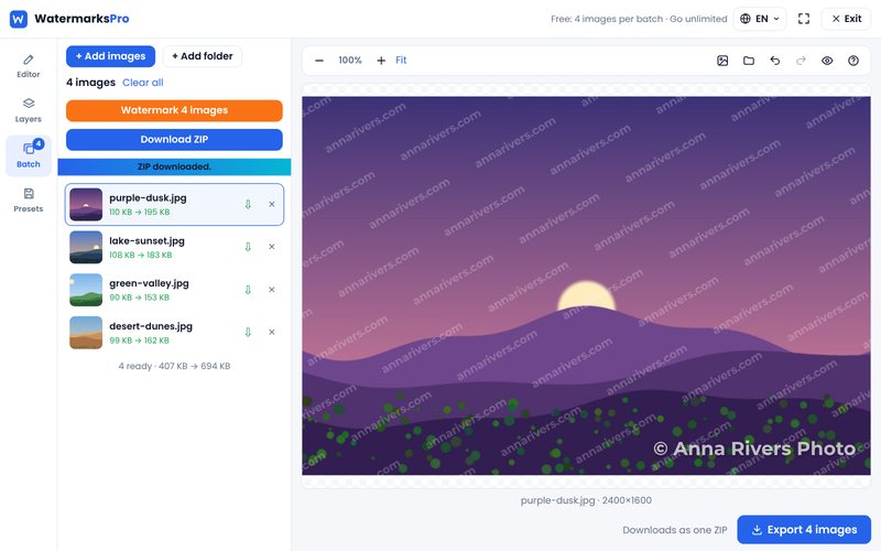
When you watermark images of different sizes in one batch, sizing relative to the image keeps every result consistent. In Watermarks Pro the layer size scales with each photo, so a batch of mixed portrait and landscape images comes out looking the same.
Color: white, black or a shadow
The safest choice is white text or a white logo with a soft dark shadow. White reads well on most photos, and the shadow keeps it visible on bright areas like sky or snow. Use black or dark grey on very bright, minimal images such as product shots on white.
Brand colors can work, but test them. A strong red or blue that looks great on your website may clash with the colors in a photo. If your brand color fights the image, use a white version of your logo instead.
Margin and position
If you place a mark near an edge, leave a margin of about 3 to 5% of the image width so it doesn't look squeezed into the corner. Remember that edges are easy to crop, though. For images that are often copied, a position nearer the center is safer.
Font and weight
Thin, decorative script fonts disappear at low opacity. Choose a clean font with medium or bold weight, and keep the text short: your name, brand or website. Long sentences are hard to read and look cluttered.
Blend modes for a softer look
A blend mode changes how the watermark mixes with the photo. "Overlay" and "Soft light" make the mark pick up the colors underneath, which looks more natural than a flat white layer. They are good for portfolios where you want protection without a heavy stamp. Watermarks Pro includes several blend modes on every layer.
Check your result in three places
- Full size: is the watermark sharp and readable?
- Phone screen: most people will see your image on a phone. Is the mark still visible when the image is small?
- Bright and dark photos: test one of each from your batch so the settings work for all of them.
Recommended starting settings
- Opacity: 40%
- Size: 15% of the image width (text) or 20% (logo)
- Color: white with a soft shadow
- Position: lower third, slightly off center
- Font: clean sans-serif, medium or bold
Save these as a template once you are happy, and every future batch takes seconds. Try them now in our free watermark tool.